Colour continuity does not mean having every room painted the same colour (but your can). It means a smooth colour transition from room to room. My preference is to choose up to 6 neutral colours for walls in a two story home and then organize them in an interesting flow from room to room. I like some surprises and greatly dislike a look that is too put together (matchey, matchey is my term). Walls are an envelope to contain the excitement you create with accessory choices.
The simplest way is to begin with a colour key or inspiration piece. It could be an art work, a piece of fabric, a photo of a scene, an area rug a piece of pottery or china - the sky's the limit. In my case I began with an artwork by Elena Popova France 11 that has a personal connection for me and always makes me feel happy....
I kept the wall colours in the house very neutral with warmer tones in north facing rooms and cooler ones south facing. Then I used colours from the artwork to choose furniture and accessories. My window treatments tend to be as neutral as my wall choices.
Deciding what your accent colours will be and how you allocate them is a personal choice. I happen to love the peaceful nature of green; I feel fresh and relaxed in its presence. It appears in many guises and in varying degrees in each room in my home. I also like purple and green together (my favourite plants are often purple). There is a direct relationship between the colour palettes I use in painting and my subject matter and what I put in my house. Sometimes we understand why we are drawn to certain colours and other times we just know what we like.
My accessory colours are green, buttery yellow and purple,
but orange keeps popping up in the art work I buy or trade (and I keep saying I dislike orange). In the dining room the walls are BM Light Khaki which has a greenish undertone. It is the only wall that is actually a "colour". I had to warm it up because it gets little light.
My accent colours move around my house in happy harmony existing in varying proportions from room to room. But what happens when you already have major furniture pieces and you want to establish a new colour scheme? Look for a fabric that already has some of your furniture colours as part of its colour scheme and move on from there.I find paintings and textiles the best sources for colour inspiration.
Here's a glimpse of how my colour scheme works .
My living room wall colour is BM Elephant Tusk which is a great neutral colour for a north facing room. The largest portion of green in my colour scheme is my living room sofa and chair. You can also see the purple reflected in the cabinet, pillow, and the flowers in the vase.
More purple, a touch of golden yellow, and one hit of red. Every room need at least one unexpected colour somewhere. My favourite "hit" colours are turquoise, lime green and red. I like to mix up patterns too. Over the years I've tired of wood tones and have been slowly removing them from furniture. The floors are enough. I've committed the worst sin by painting solid wood furniture a neutral gray!
My kitchen wall colour is BM Rockport Grey. The room sports a recycled wicker chair purchased for $40.00. A little spray paint and away you go. I've paired a golden beige with it. Remember the hit of golden in the border on the Turkish throw in the living room? A lighter version can be found in the artwork above the chair.
The sofa in the family room was the inspiration for the cabinet in the kitchen and the mantle colour. Notice the purple/ blue used as accents. Gray is repeated in this room in furniture, pillows and other accessories in slightly differing proportions than in the living room. The walls are BM Rockport Gray. It works well in this south facing room that has warm light most of the day.
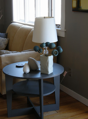
And my vase of pods moves around! The table is painted BM Iron Mountain. Love that gray.
You can see purple and green used in accessories in the porch. I now have a lovely light purple pillow. The drawers are on casters and pull out for storage. The bench is Wish AF 680 in Affinity line by BM. The walls are AF 675 Fusion (lower picture is closes to real colour). My house is as much about comfort and convenience as it is about style. It can't just look good, it has to work.
A yellow green is used as an accent in the study upstairs. This is an unusual colour combination that I took from the fabric that I used to create a stretched fabric piece.
And how about this great roman shade?
And that's how I went about developing my colour scheme. My home isn't a showpiece, it's a place where you can relax and mess it up a bit and it's always in transition. Stay tuned for my dining room make over....


0 comments:
Post a Comment